
-

- Brochure – Exterior

-

- Brochure – Interior

-

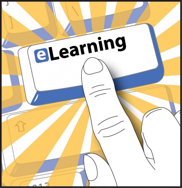
- Isolated Finger & Keyboard Illustration
-

- Website Header Logo
-

- SOL Twitter Profile Pic

Specs
Hardware: Desktop computer, Pen tablet, Mouse
Software: Illustrator, InDesign
Output: Standard 8.5″ x 11″ Paper
Output Device: HP Color LaserJet
Description
The purpose of this brochure was to provide updated program info to a variety of stakeholders; e.g., parents who walked into the office, other offices within the school system, guidance counselors, and students. There was an existing brochure, but it was plagued with errors (e.g., spelling) and outdated info, and, yet, it somehow made it to the program’s website as a PDF, for all the world to see. The need for a new brochure was clear.
At first, there was a grand idea about mass-printing the brochure through the school system’s print shop and sending brochures to guidance counselors in all of the high schools. During the beginning days of my work on this project, the constraints changed, which required occasional redesigns. The biggest constraint change was that we could no longer professionally print the brochure (lack of budget), and, therefore, we were limited to printing it on-demand through the office’s color laser printer.
The notable limitations of printing on the color laser printer were its inability to print full-bleed and its handling of colors (generic cartridges made it worse). Depending on which color laser printer we used (same model, different office), I needed to modify the gradients (the gray ribbon and the drop shadows) before printing. Furthermore, we didn’t have a paper folder, so we needed to fold the brochures by hand. The ends of the blue bands on the back panel served as guides for folding.
My work on this brochure really served as an impetus for creating new branding for the office for use in the brochure, the new website that I would begin designing and developing soon afterwards, and other assets. The keyboard design and the emphasis on the Enter/Return key was one of my earliest ideas. So, the keyboard/highlighted key served as the branding theme for print and digital collateral.
I drew the keyboard in Illustrator using an exaggerated three-point perspective. I kept the rendering simple (note the highlight in the lower-left corner of the keys). For the cover panel, I used a ribbon element to draw the eye through the text and keyboard (the eLearning key in particular), and then to the edge leading the reader to open the brochure. I carried the ribbon design into the opposite exterior panel. Regarding color, I knew that I wanted to use complementary colors that worked well on white paper, and the dark blue was consistent with MCPS branding at the time.
For one of the panels, I wanted to highlight the eLearning key and show someone pressing the key in an attempt to entice action by the reader. Drawing a full-size finger/hand would take too much space, covering most of the keys, and diminish the emphasis on the eLearning key. Therefore, I reduced the size of the finger/hand by a reasonable amount. I drew the hand in Illustrator, too.
After completing the illustrations and writing the copy, I brought everything into InDesign. There was a lot of information to convey in the brochure. I wanted to maintain the formal feel of the information, but modernize the layout a little by tying the panels together with graphic elements. FYI, the rotated titles by the shadow boxes was not my idea.
The images above show the final brochure and a few of the related graphics I used for other projects later.